
A design file can look finished and still not be ready for production.
We see this most clearly when an artwork brief says something like:
Warm gold background, Pantone red logo embossed snowflake.
The intention, indeed, is clear enough. From a printing point of view, however, several questions remain.
Is the gold a flat printed color or metallic ink or transparent color over exposed tinplate? Is the red over an opaque white undercoat? Is the snowflake embossed only or does a printed outline have to match? What will be used to approve final color?
These are significant production issues. They decide how the finished cookie tin will look and how it should be sampled and what must go into the quotation.
Printing on tinplate is not like printing on a paper carton. Metal does not accept ink, its surface reflects light, and the printed sheet still has to be cut, pressed and formed into a container. The base coating under the artwork, the varnish on top and the geometry of the tin all influence the final result.
This guide explains what CMYK, Pantone colors, metallic effects and embossing actually do – and how to combine them without turning a promising design into an unnecessarily complicated production specification.
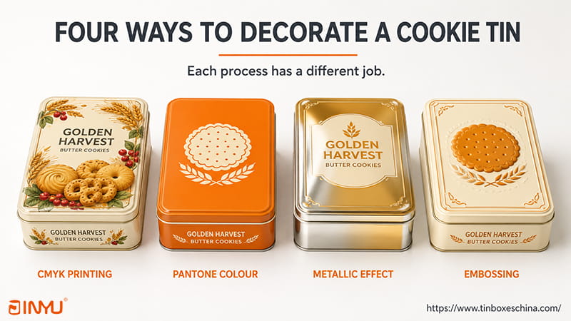
4 ways to decorate a cookie box
CMYK, Pantone, metallic effects and embossing are all used for different purposes. They are not competing tracks of the same process.
| Decorative option | Best suited for | Prime benefit | What to look for in buyers |
| CMYK printing | Photography, gradients and detailed illustrations | Can reproduce complex, multi-colour artwork | Not able to match every brand color exactly |
| Pantone spot color | Logos, solid backgrounds and colour-critical items | Specification of a solid color target | The result is still dependent on the substrate, white layer and varnish |
| Metallic Effect | Highlights, borders, seasonal details and premium backgrounds | Works with reflected light as part of the artwork | Too much reflection can make it hard to read and show handling marks |
| Embossing or debossing | Logos, simple patterns and tactile points of focus | Adds visible and physical depth | Requires tooling and must fit lid geometry |
Many successful custom cookie tins utilize more than one.
The illustration on a Christmas tin might be in CMYK, with one Pantone color for the brand logo, exposed tinplate for the snowflakes and a little embossed detail in the center of the lid.
The right question is, “How many effects can we add?”
It is, "What job should each effect do?”
Most custom decorated tinplate boxes are made using a process in which the artwork is printed before the metal is formed. The printed sheets are then cut and molded into lids, bodies and bases.
There’s a dumbed down sequence like this:
Metal decorating inks and coatings are formulated to bond to a non-absorbent substrate and still be compatible with subsequent manufacturing operations. Ink manufacturers thus view basecoats, inks, color management and overvarnishes as parts of one system. This overview from Sun Chemical on metal packaging provides a good introduction to these specialized metal decoration systems.
Printing on flat sheets also explains why the artwork needs to be checked against the correct dieline.
A logo that looks good on a rectangular mock-up might be too close to a rolled edge on the real lid. A decorative line can get lost in a corner radius. Technically, the text can be left in the file, but it will be awkward to read after being formed.
We therefore review the design according to the intended tin structure, not in terms of a generic box template.
CMYK uses four process inks:
These inks are printed in small dots in varying sizes and angles. From a normal distance the dots visually combine to produce photographs, gradients and a wide range of colors.
The design contains: If the starting point for: CMYK is usually the
A well-decorated Christmas cookie tin may contain cream, red, green, brown, blue and dozens of shades in between. CMYK can reproduce that complex color without every color having to be a separately prepared ink.
A screen shows color by emitting RGB light. A printed tin is seen in reflected light. The two are not able to produce the same range of colors.
Areas of difficulty include very saturated oranges, greens, and blues. They may appear bright on a backlit monitor but more subdued after conversion and printing.
CMYK is also less suitable where a particular solid color is commercially important. If a logo is composed of several process inks, it may be more affected by ink density and registration than a logo printed as one spot color.
Even a little text needs care. A small misalignment between the plates can blur the edges of fine characters made up of several CMYK colors. Often looks cleaner when small dark text is specified as a controlled single color.
The first thing we look at is the original product photography.
A layout might be described as ‘CMYK’ but the linked biscuit photographs are still embedded as RGB. The conversion takes place near the end of the project, when photography, backgrounds and packaging colors have been approved on screen.
Before you release it, check the production file:
A digital mock-up helps with composition. It is not the final arbiter of color on metal.
Instead of relying solely on CMYK dots to mimic the color, a Pantone spot color utilizes a separately made up ink.
Spot colors are premixed inks which are used on their own as a color . This is as opposed to process printing where CMYK inks are combined to create a bigger image . Pantone See Spot Color vs. Process Color Printing.
The Pantone printing method is especially useful for:
A Pantone code is still a starting point, not a guaranty that everything will look the same.
Paper printed with graphics has a different surface than tinned paper. The same nominal color can appear different if printed over opaque white, over exposed metal or under a matte or gloss varnish.
For colour-critical work we ask a more useful question:
If an illustration has ten shades of brown, orange and cream but only the logo orange needs to be consistent, it might be wise to print the illustration in CMYK and use one Pantone ink for the logo.
We receive a lot of artwork with many Pantone references. Before the file goes to press, we ask which colors must remain spot colors and which may be approximated in CMYK. This discussion often simplifies the specification without changing the main visual identity of the design.
There are three common approaches:
This is good for:
Often the simplest way is a full-colour gift tin.
It is suited:
Sometimes a simple design in one well-chosen spot color can be more effective than an unnecessarily complicated full color layout.
This helps when a design has both complex imagery and an important brand color.
Typical examples are:
Additional spot colors may need separate ink preparation, plates, setup, adjustment and cleaning. The cost impact differs for each artwork, order and print configuration. It should quote from the actual file, not a generic percentage.
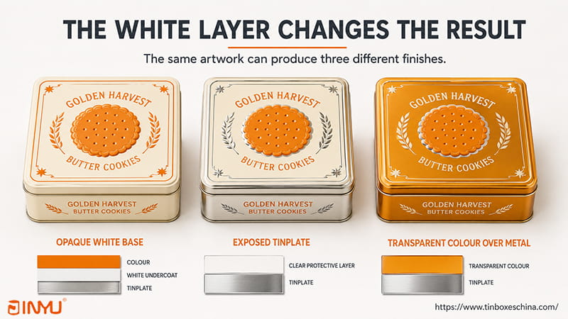
the white layer alter the result
One of the most important production files in metallic tin printing almost always involves a layer consumers will never see.
It has an opaque white underprint beneath the color inks giving a more neutral base. CMYK and Pantone colors may appear more like traditional printed colors.
Without the white layer you can see the reflective tinplate which begins to work into the design.
Artwork can therefore have three different types of area.
There is a controlled white layer under the color. This is normally used for photography, standard brand colors and areas where metallic reflection is not wanted.
White coating & opaque color are removed from selected areas, revealing the silver tinplate.
The exposed metal is then printed over with a transparent or semi-transparent ink so that color and reflection appear together.
That’s why a flattened JPG or regular visual PDF often won’t cut it for a sophisticated metallic design. The production file must show:
There’s one phrase that causes more confusion than it should:
Make this part gold.
Gold is not a manufacturing order.
It could be a flat yellow-brown, a metallic ink, a transparent amber on tinplate or another approved finish. But those don’t look the same and don’t require the same production setup.
Metallic effects can make a cookie tin feel seasonal, collectible or premium. But the term encompasses several different results.
| Metallic process | Visual outcome | Typical use | Main point to approve |
| Exposed tinplate | Shiny silver reflection of the metal itself | Snowflakes, lettering, borders and highlights | Knockout and registration of white layer |
| Colored metallic reflection | Transparent color on metal | Color and reflection on metal | Decorative areas in red, orange, green or gold |
| Metallic or pearlescent ink | A metallic effect | Logos, seals and controlled areas of gold or silver | Appearance after varnishing |
Often the best way to introduce silver reflection is exposed metal.
It is particularly effective for:
You may use a less opaque color on the exposed area, but it is not automatically “free.” The file still requires a controlled white-layer knockout, registration, varnishing, proofing and inspection.
If the boundary between the white coating and exposed metal moves, the edge can look untidy. Small metallic details thus need to be production controlled even if they appear simple in the artwork.
The transparent color allows the reflective tinplate to still be seen through the ink. It produces attractive metallic reds, oranges, greens and gold-like colors.
The result depends on the viewing angle and light. A color can appear rich if you tilt to a studio lamp, darker if you look straight on.
This effect should be approved on metal, not a printout from paper.
Specialized metallic or pearlescent inks can create gold, silver, bronze or other reflective looks.
Their effect is usually different from that of exposed tinplate. They may give a more controlled printed color, but they don't necessarily look like polished metal.
The result is influenced by the ink, the base layer and the varnish. If the metallic look is an important part of the product, ask to see a relevant physical sample.
A metallic panel may look impressive as a material sample, but still perform poorly as packaging.
The real test is whether the brand name, flavor and important information are still readable with the reflective effect behind.
Retail overhead lighting can cause glare from highly reflective areas. They may also enhance the visibility of fingerprints, fine scratches and handling marks.
Check the tin during sample approval:
Often a matte or opaque background with controlled metallic highlights gives more contrast than covering the whole lid in mirror-like reflection.
You don’t need shiny metal everyplace to feel premium.
Embossing is a process that causes certain areas of the metal surface to stand up. Debossing presses certain areas into the surface.
Both can make a logo, image or pattern visually and physically. Crown Packaging says embossing raises brand details so they can be seen and felt, and debossing depresses selected areas for a related effect. See Improving Metal Packaging With Metal Embossing Techniques.
Good prospects may be:
The artwork that contains embossing is less predictable:
There's no one-size-fits-all safe distance for every can.
Clearance depends on lid size, rolled edge, corner radius, tinplate thickness, depth of embossing and tooling design. It is to be checked on the final engineering drawing.
That drawing is where our structural review begins. We will not approve the position of an embossed logo from a visual mock-up alone, especially if it is close to a corner, edge or curved section.
A logo ready for printing is not necessarily ready for embossing.
Printed artwork can include:
The embossing art is usually simplified to a clean vector shape that the tooling can reproduce consistently.
Registration is also important. Even a small visible shift can make a finished lid feel poorly controlled, if a printed orange outline is supposed to sit right around a raised logo.
Review before tooling:
Big embossing doesn’t automatically give you big impact. Smaller logos, well placed, often look more deliberate, and are easier to repeat.
The coating on top of the ink is not just for protection of the print.
Gloss increases reflection and can make colors seem brighter or deeper. It’s great for vibrant illustrations and classic retail designs.
It might also display fingerprints and glare more easily.
Matte gives you a non-reflective surface and a softer appearance. It can make a design look more restrained but some colors may look less saturated than they do under a gloss finish.
This is important if a Pantone color has been selected from a glossy paper guide.
There is a tactile quality to a soft-touch coating that you can’t judge on screen.
This should be approved on a physical sample, taking into account the handling, scuff resistance and the relation with the printed design.
You can add a localized gloss effect, to make a logo or illustration stand out, while the rest of the surface is matt.
It also adds another requirement to the registration. Fine graphics should not be dependent on perfect alignment if process and tolerance have been agreed.
These examples show how the processes can have clear roles. They are starting points rather than fixed recipes.
CMYK takes care of the visual complexity. The brand color is protected by the Pantone ink. The metallic detail brings in controlled reflection and the embossing gives the customer one tactile center of attention.
Here, the metal is part of the illustration. Product name still needs enough contrast to remain legible.
This provides a consistent visual anchor to the product family without each color being a separate spot ink.
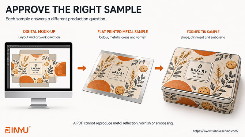
approve right sample
Digital mock-up can verify:
It cannot accurately reproduce true Pantone color, metal reflection, varnish texture or embossing depth.
A sample of metal print can verify:
It cannot fully describe what happens around formed corners, rolled edges and lid features.
A shaped sample can confirm:
Do not approve production from a PDF alone for a color critical, metallic or embossed project.
“Match Pantone 165 C” is useful, but it doesn’t necessarily mean that the color will be accepted on a cookie tin.
Agree if a color is of commercial importance:
The difference measured between a target color and a sample is often expressed as Delta E. A higher Delta E means a larger measured difference, and what is an acceptable toleranc depends on the application, according to X-Rite. See Color Consistency Mastering.
Therefore, a Delta E number from another project is incomplete. The measurement method, the substrate, the varnish and the surface condition all count.
Also, reflective metallic and embossed areas may need to be visually evaluated under controlled conditions, since their appearance varies with the angle and lighting.
An approved physical metal sample is one of the most useful references.
The printing portion of a quotation may change for the following reasons:
Embossing usually requires tooling and setup costs. Spot colors need their own ink and color control work. Additional coating or printing operations may be required for special finishes.
For a more detailed answer check out What Effects The Price Of Custom Cookie Tins?
Quote separately for optional decorative processes. This helps in making the decision for the added value of an additional Pantone color, a larger embossed area or a special finish.
When the options get complicated, ask these questions in sequence.
If yes then the specification will be likely built on CMYK.
Distinguish a logo or background if it needs to match a particular brand goal. A Pantone spot color or other approved physical standard may be appropriate.
If yes, generate clear white layer and metal reveal map. Decide if the exposed area should remain silver or be given transparent color.
If yes, select one or two suitable elements for embossing/debossing and check with the real lid geometry.
This last question is useful.
Is embossing more important than exact brand color? Is a metallic border worth more than a second Pantone? Does the customer need to feel the logo, or is the contrast on the shelf doing the work?
A good quote is the result of a clear list of priorities.
"A completed 3D render still has value for presentations. It is not a specification for metal printing.
A useful RFQ for printing can be divided into four groups.
An instruction such as "CMYK, gold and embossed logo" still leaves too many production questions unanswered.
A working spec would look like:
Print the main illustration in CMYK with an opaque white coating. Print logo in approved Pantone color on white background. Leave the marked snowflake layer as exposed tin plate. Use matte varnish throughout with only the central logo embossed. Final color, metallic areas and embossing are subject to approval on the formed metal sample.
That is something that a factory can look at and quote on.
Usually the default process for full-colour artwork is CMYK. Additional Pantone inks may need separate ink preparation, plates and setup. The actual difference depends on artwork, quantity, SKUs and how you configure the printing.
CMYK can approximate many Pantone colors, but not every single spot color is in the CMYK gamut. The acceptability of an approximation depends on the commercial importance of the color.
RGB light is emitted by a display. The reflected light is viewed through a tin print. The result is influenced by tinplate, white layer, ink density, varnish and viewing conditions.
The guide and the tin is on different substrates. Surface varnish, opaque white and exposed metal also contribute to the appearance.
The exposed metal is the actual tinplate surface that produces the reflection. Metallic inks are inks that create a printed metallic look using specialized pigments. The two effects look different.
Transparent amber or orange over reflective tinplate can provide a gold like metallic appearance. The effect should be checked on a metal sample.
Fine text, complex shading and closely packed lines usually don’t reproduce as cleanly as simple, bold vector art.
It can yes. Embossing will distort the printed metal and therefore the ink, varnish, relief and registration must be considered as a whole.
There is no such universal distance for all structures. It must be determined from the lid geometry, edge construction, material and tooling.
It is very suitable where color accuracy, metallic effects, surface finish or embossing are important. The reflection of metal, tactile relief or the final varnish cannot be reproduced faithfully in a PDF.
Yes. Each process should have a clear purpose. Each extra effect adds to specification, proofing and production complexity.
More effects is not better packaging.
A good specification assigns a clear role to each process:
Jinyu: Before we go into mass production, we check the artwork against the intended structure. “We can check dieline, identify color and metallic area risks, review embossing placement and recommend a good sample route.
Jinyu has more than 3,000 molds and structures in stock. The normal MOQ for custom printed cookie tins is 5,000 pcs per size and design. Generally, sampling takes 7-10 days, and mass production takes about 25-35 days after sample approval.
If you are working on a new cookie tin, please send us:
We will consider the decoration as part of the whole packaging system, not as a series of effects to be added after the tin has been picked.
Explore our custom cookie and biscuit tin packaging options.

Obtenez les dernières informations et offres spéciales


 Réseau IPv6 pris en charge
 Français
 English
 Deutsch
 Español
 Português