
Tin packaging for chocolate works best when the tin tells a coherent story about the product, not when it’s a collection of disparate decorative effects. The following ideas are based on practical visual directions for luxury chocolates, artisan products, seasonal collections, wedding favors, corporate gifts and collectible editions. Each concept links the tin shape, artwork, finish and inner presentation so brands can translate a design theme into packaging that is identifiable, gift-ready and manufacturable.
| Collection Goal | Recommended Tin Format | Visual Direction | Useful Finish or Detail |
| Luxury truffles | Square or shallow rectangular tin | Black, burgundy, navy or dark green | Embossed logo, matte finish, fitted tray |
| Artisan or bean-to-bar chocolate | Rectangular or hinged tin | Cocoa-origin illustration, ingredient storytelling | Muted colors, inside-lid story, paper insert |
| Valentine collection | Heart-shaped tin | Red, blush, cream, floral or ribbon graphics | Metallic accents, embossing, message inside lid |
| Christmas collection | Round, square or large sharing tin | Winter scenes, ornaments, nostalgic illustration | Numbered designs, metallic effects, dividers |
| Wedding or event favors | Small round, square or heart tin | Names, dates, monograms, soft neutral colors | Personalized label, mini pouch, message card |
| Corporate chocolate gifts | Hinged rectangular or square tin | Clean brand colors and restrained logo placement | Inside-lid message, flavor map, fitted insert |
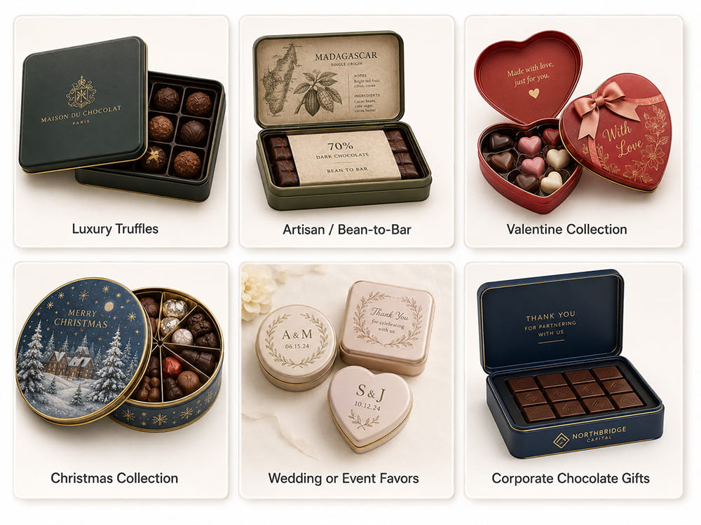
Best for: dark chocolate truffles, gourmet pralines, corporate gifts and high-end retail assortments.
One of the most obvious luxury chocolate packaging ideas is a matte black tin with controlled gold detail. The design should feel confident in its use of space; a logo in the center, a thin border, or a small cocoa symbol usually look more premium than a lid full of decorative elements.
Recommended structure: shallow square tin or rectangular tin with single layer tray. To keep the chocolates evenly spaced use paper cups or a fitted liner.
Production note: large dark print areas can be more prone to scratches and rubbing. Think of protective packing and use shapes and lettering which are not too fine on the embossed area.
Best for: winter assortments, thick ganache, chocolate covered cherries, nut pralines and fine Christmas gifts
Burgundy, copper and cream are a warmer alternative to black-and-gold packaging. The palette lends itself particularly well to chocolates associated with winter flavors such as cherry, hazelnut, cinnamon, coffee, orange peel or liqueur-style fillings.
Burgundy could be the main field of a rectangular or square chocolate tin with copper coloured linework around the edge and a cream label block for the product name. The sidewall may repeat a cocoa-pod or ingredient pattern without competing with the main lid.
Collection opportunity: Keep the same mold and layout, then switch one accent color for dark chocolate, milk chocolate and nut assortments.
Best for: single-origin chocolate, bean-to-bar brands, artisan makers and regional chocolate collections.
This idea turns the tin into a compact space for stories. Replace the generic cocoa graphics with an origin map, landscape, farm illustration, cocoa variety or regional pattern that is associated with the actual chocolate.
A rectangular tin is a good choice as the lid provides space for both the illustration and origin information. The inside lid can continue the story with harvest notes, tasting characteristics or a brief explanation of the producer relationship.
Design rule: the origin story has to be specific enough to feel real. Generic farm images that are not obviously product related may look attractive but they don’t have the same sense of provenance.
Best For: Orange chocolate, Coffee chocolate, Sea-salt chocolate, Nut varieties, Berry fillings, Flavored truffles.
Ingredient led design helps shoppers quickly understand flavor. Choose a uniform tin template, then give each flavor a unique illustration and accent color. Burnt orange for orange peel, deep pink for raspberry, brown and copper for coffee, navy and mineral grey for sea salt.
The logo, typography, border and tin shape will remain the same across the range. Only the illustration of the ingredient, the color band and the flavor name have to change. This creates a collection that is easy to identify and allows customers to easily differentiate SKUs.
Handy inner detail: When several varieties of chocolate are packed in a tin, add a small flavour map card.
Best for: craft chocolate bars, high-cocoa products, small-batch releases, and modern specialty retail.
Minimalist packaging is not a design in the void. Every element has its own purpose, that is to say. Simple wordmark, cocoa percentage, origin name and one controlled graphic can produce a confident look without the visual language of mass-market gift chocolate.
A slim rectangular tin is good for bars or flat chocolate formats. An artisan position can be supported with a neutral cream, clay, charcoal, muted green or natural brown. A small embossed mark can give the tin the tactile value without making it formal luxury packaging.
Production note: check for sufficient space between small type and curved edges of lids. Fine typography should be contained in stable, flatter printing areas.
Best for: Valentine chocolates, romantic gifts, anniversaries, engagement gifts and limited edition pralines.
The heart-shaped tin conveys the occasion immediately so the artwork doesn’t need to repeat heart symbols all over the surfaces. Or perhaps a cleaner idea is to have a blush, ivory or deep red base with a floral line, ribbon inspired border or short message.
The strongest part of the logo or Valentine message will be between the middle of the lid. Important text should not be in the deepest curves of the heart outline. Inside, paper cups or a shaped tray can help make a neat chocolate presentation out of the unusual outside shape.
Alternative direction Use same heart tin for weddings - change seasonal message to names, initials and event date.
Ideal for: holiday gift baskets, family tins to share, chocolate sandwich cookies and limited-edition retail collections.
The best Christmas tin programmes are created as a series, not as a new, unconnected picture every year. Pick a repeatable visual system, like a winter village, illustrated ornaments, nostalgic transport scenes, or a series of festive characters, and release one or more coordinated designs each season.
A round or large square tin is good for sharing chocolate and cookie assortments. Numbering the designs, adding the year discreetly and keeping the logo in the same place can promote collection without making the package feel like short-term advertising.
Think about reuse: artwork with a decorative appeal is more likely to be kept than packaging dominated by promotional text, discount messages or temporary sales claims.
A egg tin can make the structure itself part of the Easter story. Seasonal themes can be supported by pastel colors, spring flowers, garden illustrations and playful characters, but the design still needs a clear brand area and product identity.
Use chocolate eggs individually wrapped or a fitted pouch for smaller gift tins. For larger tins a window may be incorporated to show off colourful contents, but the window should only be used when the arrangement inside will look attractive during handling and retail display.
Design balance: Playful packaging can still be orderly. Keep the main palette limited and avoid small decorative elements near the product name.
Best for Bridal showers, Wedding favors, hotel welcome gifts and event chocolate keepsakes.
Wedding tins should be personal but not too complicated. Typically, couple names, initials, the date of the event and one floral or architectural detail will suffice. Use ivory, blush, champagne, sage, pale blue and soft metallic accents in a variety of wedding themes.
Mini chocolates, mints or a sealed candy pouch can fit in small round, square or heart tins. A simple message of thanks inside the lid or on a small card can add meaning without a more complex exterior design.
Practical option: just change the printed artwork for different events, venues or private-label clients but use one existing mold.
Best for: client gifts, employee gifts, event boxes, hotel amenities, branded chocolate programs
Corporate chocolate packaging often relies too much on logos. Better to keep the outside restrained and put the message on the inside flap. The outside can have the company’s main color, a subtle pattern and a small logo; the inside can have a thank-you note, campaign statement, QR code or event message.
A hinged tin makes this point nicely as the lid is attached and it just naturally presents the message when opened. A flavor map or branded card can be placed on top of the tray.
Positioning note: tin has to still feel like a chocolate gift, and not an office merchandise. Product photography, chocolate names and inner presentation should still be part of design.
Best for: color-filled bonbons, hand-decorated chocolates, seasonal shapes, visually coordinated assortments
Window tins work when the chocolates themselves are part of the visual attraction. The window can eliminate the need for product photography and customers can see the color, arrangement and quantity before purchasing.
The printed area around the window should frame the product and not compete with it. Utilize the border for brand name, flavor family and gift occasion. Inside the tray must be held in alignment so that the product does not move away from the viewing area.
Do not use a window by default: The individual wrapping of chocolates in mixed colors is less effective; the arrangement may shift, or the product may need stronger light protection.
Best for: premium launches, cultural partnerships, museum shops, fashion collaborations and collectible gift programs.
A successful artist collaboration sees the tin as a complete artwork, not as a logo on top of an illustration. The shape, the lid composition, the sidewall pattern and the inside message should all support the creative concept.
Numbered editions, artist information inside the lid and a small signature detail can increase collectability. An existing standard mold might be preferable as it leaves more of the budget and attention to be focused on artwork, printing and presentation.
Series idea: 3 coordinated designs released on the same mold and packaging structure, and let the retailers or customers pick or collect the set.
Ideal for travel retail, hotel gifts, airports, museums, tourist shops and regional chocolate products.
A destination tin should use a visual language which is recognizable but original: a skyline, a local architecture, a landscape, a transport symbol, a traditional pattern or an illustrated map. Don’t make it a generic landmark photo with unrelated decorative elements around it.
Compact round and rectangular tins are good for travel retail because they are easy to carry and re-use. The artwork can be seen as a memento, and the sidewall provides practical product and destination information.
Collection strategy: one layout for several cities or destinations, changing only the central illustration and color palette, keeping the system of the brand.
Best for: organic chocolate, vegan assortments, botanical flavors, natural ingredients and wellness-minded gift lines.
Botanical design can convey the ingredients and positioning of a product without the generic green packaging. Cocoa leaves, herbs, fruit, flowers and spices can be shown in a controlled composition that reflects the actual flavor profile.
Muted greens, cream, clay, soft browns and natural pinks work with matte finishes and restrained typography. The result should be calm and ingredient-led, not rustic for the sake of rustic.
Useful detail: Don’t crowd the outside with ingredients, flavor notes or sourcing story. Use the inside lid or an insert card.
Best for: refill programs, permanent product lines, home sharing packs and brands seeking strong after use value.
The idea is to make this concept useful after the first buy. The tin should avoid overly temporary seasonal messages and use artwork that would occur naturally in a kitchen, living room or gift-storage setting.
Chocolate tins can be square, rectangular or round in shape with subtle branding, a hard wearing surface and a lid that can be opened and closed time and time again. Refill pouches, flavor labels or removable paper bands can offer updated product information while the core tin stays the same.
Brand advantage: The customer sees and uses the package, but future chocolate purchases can use lighter refill packaging where appropriate.
| Keep Consistent | Change by Season or Flavor | Why This Helps |
| Tin shape and dimensions | Main illustration or seasonal pattern | Allows the collection to use the same mold and inner tray. |
| Logo position | Accent color | Keeps brand recognition stable across multiple SKUs. |
| Typography system | Flavor name or occasion message | Makes the range easier to navigate without looking repetitive. |
| Border, frame or sidewall pattern | Central artwork | Creates a collectible family of tins rather than unrelated packages. |
| Tray format and chocolate count | Inside-lid message or flavor card | Reduces structural changes while allowing each edition to tell a new story. |
This article focuses on the visual concepts and collection planning. Read How to Build Better Chocolate Tin Packaging for in-depth guidance on trays, product protection, food contact considerations and filling structure.
A new brand can start with an existing round, rectangular or square mold and invest in a strong artwork system, consistent colors and one useful finish. A new custom mold is usually more appropriate when the shape is central to the product identity and expected order volume supports the tooling.
Three to five coordinated designs are usually enough to create variety without making artwork, sampling, inventory and reordering unnecessarily complex. The designs should share a clear visual system.
No. Burgundy and copper, cream and gold, navy and silver, dark green and brass, or a carefully controlled monochrome palette can also communicate premium positioning. The quality of spacing, typography and finish is more important than one specific color combination.
No. Heart tins also work for weddings, anniversaries, engagement gifts, Mother’s Day and romantic limited editions. The artwork determines whether the tin feels seasonal, formal or suitable for year-round gifting.
A window is useful when the chocolates are decorative, colorful and consistently arranged. A fully printed lid is often better when the product can move, requires stronger light protection or is intended to create a surprise when opened.
The inside lid can carry a flavor map, cocoa-origin story, thank-you message, artist information, gift note, seasonal greeting, QR code or instructions for reusing the tin.
Use one existing mold, one tray structure and one design grid across several flavors or seasons. Change the central artwork, accent color and message rather than redesigning the complete package for every SKU.
Obtenez les dernières informations et offres spéciales


 Réseau IPv6 pris en charge
 Français
 English
 Deutsch
 Español
 Português